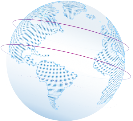
Map data visualization at global scale
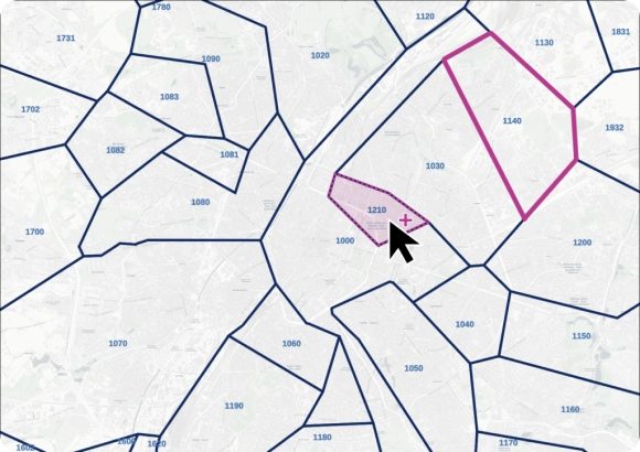
Granular data to build highly accurate maps at any scale
Map visualization in your software of choice
Our self-hosted database is standardized and pre-aggregated by zip code and administrative areas, making it ready to use in your visualization tools.
Perform global data visualizations
Global point and boundary coverage even in difficult geographies such as China, the UK, Russia, or Brazil.
Get up to 6 levels: A zip code layer and up to 5 administrative levels.
Data you can trust and rely on
Our advanced data pipelines capture, clean, format, and integrate new data on a weekly basis. Our proprietary data-mastering processes guarantee shape accuracy and reliable coordinates.
Trusted by industry leaders
Join more than 100 enterprise clients who trust GeoPostcodes for their location data
Anjo Grebe
Consultant

Dr. Peter Wild
Managing Partner

Kousha Mazloumi
Director of Data Science

Kousha Mazloumi
Director of Data Science

William Chao
Product Owner of Geographic Information Services

Kate Kilby
Senior Product Manager

Dave Hamm
Project Manager


Kavian Ranjbar
Data Governance Specialist

Nick Beaugié
Senior Software Engineer
Exert full control over your maps
Rich attributes

Understand the data behind your maps
Our team combines 15 years of experience in Enterprise geodata integration with an in-depth knowledge of each country’s postal structure.

Why choose GeoPostcodes

Global coverage
Complete coverage across 247 countries, including hard-to-source geographies like China, Japan, Brazil, and Russia.

Highest quality
Built on extensive, authoritative sourcing with robust data engineering and quality control. Standardized and up-to-date.

Expert Consulting
With 15 years of experience, we guide your implementation and deliver data in the format that fits your system.
Check our related map data visualization articles


Frequently Asked Questions
Postal boundaries help users convert raw data into meaningful shapes that work well in map data visualization projects. When combined with accurate geographic data, these boundaries allow teams to organize data points by regions and support visualization tasks that require structure rather than individual points alone. This helps analysts visualize data with more precision and derive clearer insights.
To better understand how postal codes affect mapping accuracy, see our guide on How to Create a ZIP Code Map.
You can visualize boundaries at country, region, city, or ZIP-code levels by loading standardized spatial data into an interactive map. This supports layered map data visualization, allowing you to switch granularities and analyze data points at different scales. Visualizing multiple levels helps teams identify patterns and extract deeper insights from complex datasets.
For a practical example, explore Create a ZIP Code Map in Tableau.
Vector boundary files offer precise lines and shapes ideal for map data visualization, while raster files display boundaries as pixel grids. Vectors are best for flexible custom map creation, interactive maps, and detailed spatial analysis. Raster formats are better suited for background layers or broad geographic overviews.
If you need clarity on postal polygon structure, see How to Build a Postal Code Polygon Database.
Administrative and postal boundaries are updated regularly to ensure fresh geographic data for map data visualization. Frequent updates maintain accuracy across regions where boundaries change, enabling strong spatial analysis and reliable reporting.
To understand why boundary accuracy matters, you can review How Often Do ZIP Codes Change?.
Interactive maps allow users to click, zoom, filter, and move through geographic layers, creating a richer map data visualization experience. This strengthens exploration, helps teams build custom maps, and accelerates insight discovery. When teams can navigate data visually, they uncover patterns more quickly and make better decisions.
For an applied example, see GeoPostcodes for ArcGIS.
Effective map data visualization turns raw data into visual formats that highlight geographic relationships and trends. By using structured spatial data and reliable location inputs, organizations convert map views into strategic intelligence, making it easier to interpret patterns and act with confidence.
For deeper context on geographic analysis, read Enterprise Location Data Management Explained.
Accurate geographic data enriches data visualization by grounding values in real-world locations. When combined with map data visualization techniques, this produces interactive maps that expose relationships, enhance navigation, and reveal actionable insights across regions.
Learn how postal geodata supports spatial accuracy in Zip Code Analysis: How to analyze business data using zip codes?.